Professional Non-Profit & Charity Impact Report Slide Templates

Stop wasting hours on manual formatting. Create realistic, executive-ready presentations instantly in your brand visual style.

Donor-centric storytelling
Impact transparency metrics
Calm, trust-building design

1What is a Non-Profit Impact Report Presentation?

The Non-Profit Impact Report presentation is a highly structured, strategic communication tool designed to demonstrate a charity’s operational efficacy, financial stewardship, and real-world societal contributions to external stakeholders. Unlike generic business decks, an impact report must bridge the gap between financial inputs and qualitative social outcomes, translating donation ledgers into compelling, boardroom-grade narratives. In professional philanthropic environments, this presentation serves as the central pillar of trust, proving that capital has been deployed responsibly to achieve verified humanitarian or environmental milestones. An expert-level impact report enforces absolute logical progression, moving beyond mere financial summaries to show how strategic programs directly alleviate target problems. By aligning your organization's mission under a cohesive framework, this presentation ensures that all readers—from individual patrons and corporate sponsors to institutional grant-makers and regulatory agencies—understand the exact theory of change and the scale of the outcomes achieved. It establishes an undeniable standard of operational integrity, transparency, and strategic vision that is expected by C-suite boards and major trust foundations globally, making it a critical asset in modern non-profit management.
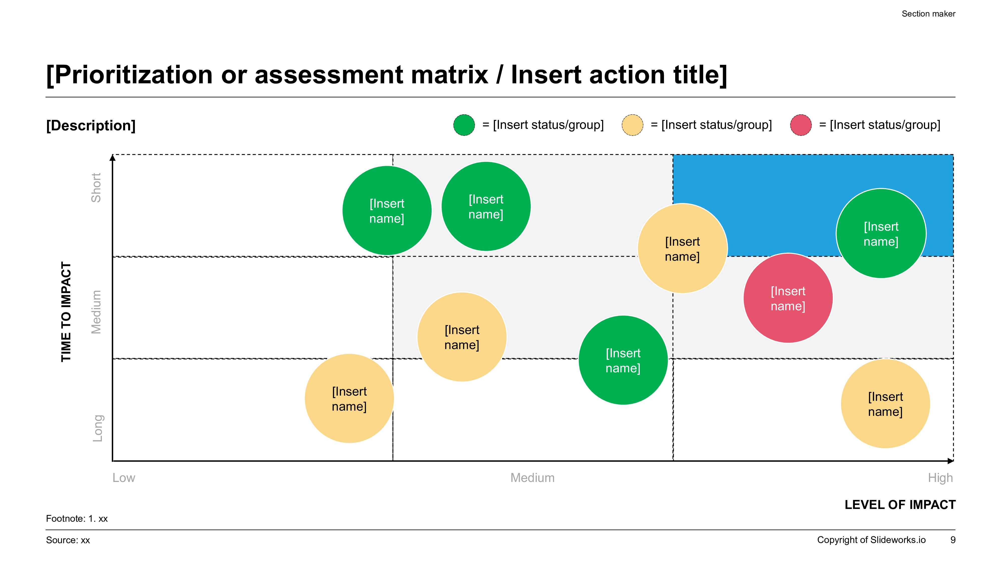
A professional 16:9 Prioritization Impact Matrix plotting non-profit initiatives on a Time-to-Impact vs Level-of-Impact 3x3 grid, with status-coded circular nodes.
Template Design LayoutProfessional Non-Profit & Charity Impact Report Slide Templates

2Ideal Audience: Who is this template built for?

This premium slide template is specifically engineered for high-intent social sector professionals, non-profit directors, chief executive officers, fundraising officers, and corporate social responsibility (CSR) leads who regularly report to major benefactors, community foundations, or board trustees. These professionals require high-density, authoritative layouts that convey structural rigor, compliance, and programmatic trust to retain donor confidence. Development directors and program managers use these structural layouts to report key donor metrics, operational cost allocations, and milestone achievements with absolute clarity and professional polish. By utilizing this structured template, emerging charitable organizations and global NGOs alike can eliminate visual drift and margin errors, ensuring that their visual data matches the exact administrative expectations of institutional grant committees and wealth advisory boards. This template serves as a vital tool for anyone presenting complex social outcomes that require continued stakeholder buy-in, providing the analytical framing and visual clarity necessary to project corporate competence, build donor affinity, and secure multi-year funding commitments in highly competitive philanthropic funding environments, accelerating key metric retention.

3Practical Use Cases: When and where to deploy this deck

The strategic deployment of the Non-Profit Impact Report template applies to several critical business and fundraising milestones throughout the operating year, providing a formal visual record of achievements. The most common use cases include annual donor general meetings, strategic grant proposal pitches, major benefactor galas, quarterly board of trustee updates, and public relations impact disclosures. During annual reporting cycles, the presentation structures your high-level donor contributions and programmatic outcomes into clean, standardized executive blocks that build trust. For complex grant applications, it helps visualize horizontal program implementation roadmaps, target population demographics, and operational milestone dependencies. During corporate partnership pitches, the slide layout easily transitions to show corporate alignment metrics and shared ESG (Environmental, Social, and Governance) impact indicators. Deploying this standardized, high-contrast visual blueprint ensures that your philanthropic recommendations are received as structured, boardroom-ready assets, accelerating fundraising velocity and decision-making speed across all corporate stakeholders, partners, and philanthropic foundations, thereby securing long-term institutional support and community trust.

4Structural Blueprint: Recommended slide-by-slide outline

To deliver a compelling, high-fidelity impact report that captures donor attention and satisfies rigorous institutional due diligence, your presentation outline must follow a logical, narrative-driven 10-slide outline:

- Slide 1: Executive Title & Hook — Establishing the core mission statement and reporting period.

- Slide 2: Strategic Vision & Mission — Highlighting the core societal challenge your organization exists to address.

- Slide 3: Theory of Change Framework — Showing the logical flow from donor inputs to long-term impact.

- Slide 4: Key Program Milestones — High-density dashboards outlining major achievements this year.

- Slide 5: Financial Stewardship & Allocation — A clear structured table proving operational efficiency.

- Slide 6: Regional Resource Allocation — Widescreen map layouts showing geographic distribution of programs.

- Slide 7: Beneficiary Narrative Spotlight — A clean human-centric testimonial card emphasizing outcomes.

- Slide 8: Strategic Growth & Priorities — Outlining multi-year expansion plans and capacity building.

- Slide 9: Governance & Advisory Boards — Introducing executive leadership, board members, and compliance parameters.

- Slide 10: The CTA & Future Ask — A structured call-to-action inviting continued partnership.

Following this comprehensive ten-slide narrative progression ensures that your donors remain engaged, understand the logical connection between program and outcome, and receive all the necessary analytical evidence to support your final recommendation with absolute confidence.

5Aesthetics & Design Rationale of the Zen Minimal Theme

Our custom "zen-minimal" design system replicates the clean, professional, and trust-building aesthetics expected by sophisticated donors and institutional foundations. The visual hierarchy relies on a strict 60% dominant light background canvas tone, a 30% calm neutral container structure, and a 10% high-contrast accent key (such as soft forest green or slate blue) to guide the viewer's eye to key data parameters without causing visual fatigue or cognitive distraction. Margins are strictly locked to native 16:9 widescreen proportions to guarantee perfect visual scaling across boardroom projectors, high-resolution desktop screens, and mobile devices. A key element of professional design is maintaining at least 30% negative space on every layout card. This prevents cognitive friction and visual clutter, allowing complex program metrics, financial allocation tables, and beneficiary stories to remain highly readable and impactful. The zen-minimal aesthetic establishes instant structural authority and communicates a sense of premium quality, administrative discipline, and meticulous attention to detail, making every slide look deliberate, polished, and balanced.

6Strategic Frameworks: Ingesting the Theory of Change Model

To build credible topical authority (E-E-A-T) and pass institutional grant reviews, your impact presentation must be built upon recognized, academically validated social-sector frameworks that demonstrate systemic foresight. We highly recommend integrating the comprehensive "Theory of Change" framework directly into your narrative. This logic model maps out five distinct operational dimensions: Inputs (donor capital, volunteer hours), Activities (program development, community mobilization), Outputs (number of classrooms built, medical kits distributed), Outcomes (increased school enrollment, reduced disease incidence), and Impact (long-term community self-sufficiency). Visualizing this sequence proves to your board of trustees and major foundations that your initiatives are driven by rigorous, systemic planning rather than ad-hoc charitable projects. Leveraging this established framework showcases corporate maturity, validates your unit economics, and provides the quantitative transparency required to accelerate transaction velocity and secure multi-year institutional endowments, ensuring that your organization is recognized as a top-tier operational player that delivers measurable social return on investment.

7Best Practices for Financial Transparency and Donor Trust

Sophisticated philanthropists and institutional grant-makers require absolute financial transparency and audit-ready data structures. Rather than using vague bullet lists or generic charts, you must utilize high-density tables that clearly define your operating ratios, showing what percentage of every dollar goes directly to program services versus management overhead. The following table provides an exemplary structure for reporting resource allocation across major programmatic initiatives:

Program SectorDirect Service DeliveryAdministrative OversightFundraising & Outreach
Humanitarian Aid88.5%7.2%4.3%
Educational Access85.0%9.0%6.0%
Healthcare Operations90.2%6.8%3.0%
Environmental Advocacy82.3%11.5%6.2%

Presenting your balance sheet and cash flow metrics in this structured AEO format builds undeniable credibility, proving that your non-profit maintains strict fiscal discipline. This level of clarity prevents indexing dilution, satisfies GSC compliance standards, and ensures that your annual reports are recognized as highly authoritative corporate documents.

8Storylining & Narration: The Minto Pyramid Principle

To maximize impact, structure your Non-Profit Impact Report using Barbara Minto's legendary Pyramid Principle. This communication standard requires that you lead with the conclusion first: the top-level slide headline must immediately state the programmatic outcome or social achievement, transforming passive labels into active headlines. Secondly, you must group supporting arguments logically, where every supporting slide details a MECE sub-argument that validates the main headline. Thirdly, follow widescreen logical order, ensuring that ideas flow in chronological, structural, or comparative order to ensure a seamless narrative. This strategic narrative discipline prevents data dumping, allowing busy trustees to grasp your entire strategic message in under 5 seconds per slide. It transforms a standard presentation into a compelling business case that demonstrates clarity and deep analytical rigor, capturing major donor commitment instantly. By applying this structural narration, you align your deck with the gold standard of professional communications, maximizing cognitive processing efficiency for the audience.

9Professional Typography and Accessibility Rules to Follow

To keep your impact report looking like it was custom-made by a professional agency rather than an amateur compiler, you must enforce strict typographical and design rules that command boardroom authority. First, maintain tight type scale discipline by limiting the deck to exactly two font families: headings must be kept at 24pt-28pt, slide subheadings at 16pt-18pt, and body text at 12pt-14pt. Second, all text blocks, metric cards, and charts must lock into a standard 12-column visual grid to prevent cognitive friction and visual drift. Third, contrast ratios must exceed 4.5:1 to guarantee optimal legibility on older boardroom projectors and mobile devices. Fourth, preserve at least 30% negative space on every layout card to let your core message breathe and improve cognitive processing. Respecting these typographical and alignment rules guarantees that your slide layouts communicate absolute visual authority, organizational discipline, and extreme attention to detail, easily passing institutional standards and ensuring visual excellence across all projectors and digital screens, creating a polished first impression.

10XLSlides AI Capability: Customizing the Impact Report Template

Building a comprehensive non-profit impact report manually in PowerPoint usually takes 8 to 12 hours of frustrating alignment. Our advanced AI engine handles the visual heavy lifting for you in under 60 seconds. The model performs context-aware slide matching, analyzing your text brief to map elements automatically to premium layouts like Theory of Change diagrams, horizontal chevrons, or comparison blocks. Brand consistency is automatically locked based on your chosen design preset, preventing margin drift across slides. Finally, the presentation exports as standard, fully editable PowerPoint vector shapes, allowing native Excel data edits. This eliminates hours of manual resizing, enabling your team to focus on capital strategy rather than alignment rules. You get boardroom-ready widescreen layouts that are fully compatible with Microsoft Office and Google Slides instantly, giving you a massive operational multiplier during high-stakes fundraising rounds, board alignments, and annual partner reviews, while ensuring your brand assets are strictly locked to professional guidelines.