Customer Experience Audit Report Template

Stop wasting hours on manual formatting. Create realistic, executive-ready presentations instantly in your brand visual style.

NPS & CSAT visualizations
Experience gap identification
CX optimization roadmaps

1What Is a Customer Experience Audit Report?

A customer experience audit report is a structured presentation that diagnoses how customers experience a company across key journey stages and touchpoints. It normally combines quantitative metrics such as NPS, CSAT, customer effort score, churn, retention, contact rate, conversion rate, and support resolution time with qualitative evidence from interviews, reviews, surveys, calls, complaints, and frontline feedback. The goal is not to create a decorative journey map. The goal is to identify where the experience breaks, why those breaks matter commercially, and which fixes deserve priority. A good audit links customer friction to business outcomes such as lost conversion, lower expansion, higher support cost, weaker loyalty, or renewal risk. This template helps teams present the findings in a way executives can act on. It turns scattered voice-of-customer evidence into a coherent diagnosis, root-cause analysis, and roadmap for measurable improvement. It also clarifies which functions must coordinate to change the experience sustainably.
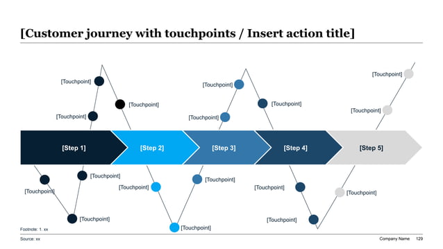
Customer experience audit slide with a five-step journey map, zigzag touchpoint path, and labeled friction points across each stage
Template Design LayoutCustomer Experience Audit Report Template

2When to Use This CX Audit Template

Use this template when leadership needs a clear view of customer pain points and the operational changes required to improve them. Common use cases include declining NPS or CSAT, rising churn, weak onboarding completion, digital checkout friction, support backlog, service recovery failures, poor renewal health, inconsistent branch or store experience, and product adoption problems. It is also useful before a customer journey redesign, customer success transformation, digital self-service program, or board review of customer health. The template gives CX, product, operations, marketing, and support teams a shared structure for discussing evidence instead of anecdotes. If teams disagree about what customers are actually experiencing, an audit presentation can align them around facts, journey stages, root causes, and priorities. It is especially valuable when multiple functions own different parts of the experience and no single team can solve the issue alone. The format keeps the discussion anchored in decisions, not sentiment alone.

3Recommended CX Audit Report Structure

A decision-ready customer experience audit usually follows a ten-slide narrative. Start with the executive finding: which journey problem matters most and what should be fixed first. Then show the current customer journey, including acquisition, onboarding, usage, support, renewal, and advocacy stages where relevant. Next, present headline metrics such as NPS, CSAT, customer effort, churn, retention, conversion, ticket volume, and resolution time. The middle section should map customer pain points by stage, severity, frequency, root cause, and commercial impact. After that, include qualitative evidence from surveys, interviews, complaints, and frontline notes to explain the human experience behind the metrics. Close with priority initiatives, roadmap, owners, expected KPI impact, and decisions required. This structure prevents the deck from becoming a survey report. It leads with the business decision, supports it with evidence, and ends with a practical improvement plan. The same outline works for quarterly CX reviews and transformation steering committees too.

4Mapping the Customer Journey and Touchpoints

A CX audit needs a journey map that is simple enough for executives to scan but specific enough to guide action. Define the major stages first, then map the touchpoints customers actually encounter: ads, website pages, sales conversations, demos, onboarding emails, product screens, invoices, support tickets, account reviews, renewal notices, and community or referral moments. For each touchpoint, note the customer goal, emotional state, friction, owner, channel, and available data. The suggested XLSlides image works well for this job because the five-step chevron path can represent a journey while the zigzag touchpoint line shows where customers move above or below expectations. Avoid mapping every possible interaction if it does not change the decision. The best journey maps highlight the few touchpoints that create disproportionate pain, cost, or loyalty impact. That focus helps teams move from broad empathy language to concrete operational fixes. Add segment overlays when enterprise, SMB, or consumer journeys differ.

5NPS, CSAT, CES, and Experience Metrics

Customer experience metrics should be grouped by the question they answer. NPS helps show loyalty and advocacy, but it does not explain the exact operational issue. CSAT helps evaluate satisfaction after a specific interaction, such as support or onboarding. Customer effort score shows whether customers struggle to complete a task. Operational metrics such as response time, first-contact resolution, abandonment rate, repeat contact rate, activation completion, retention, renewal, expansion, and complaint volume explain where experience problems become business problems. A strong CX audit dashboard combines these metrics instead of relying on one score. It should also segment results by customer type, product, region, channel, lifecycle stage, or account value. Executives need to know whether the problem is broad or concentrated. If a low score comes mainly from enterprise onboarding or mobile checkout, the improvement plan should be targeted there rather than spread thinly across the entire journey. Show baselines and targets so progress can be reviewed later.

6Pain Point Prioritization and Root Cause Analysis

A CX audit becomes useful when it separates symptoms from root causes. Customer complaints may mention slow support, confusing pricing, missing features, unclear communication, or difficult setup, but the root cause may sit in process design, ownership gaps, product constraints, staffing, data quality, policy, or training. The deck should map each pain point by frequency, severity, customer value affected, operational owner, and estimated business impact. A simple impact-versus-effort matrix can help prioritize fixes, but it should be grounded in evidence rather than opinion. For example, a high-frequency low-severity issue may still deserve attention if it creates thousands of support contacts, while a low-frequency high-severity issue may matter because it affects strategic accounts. Root-cause slides should connect journey evidence to operational diagnosis. This avoids the common mistake of recommending surface-level communication changes when the real issue is workflow, data, product, or incentive design. Make the evidence threshold explicit for every priority.

7Voice of Customer Evidence and Qualitative Themes

Qualitative customer evidence gives the audit credibility because it explains why metrics moved. Include themes from interviews, open-text survey responses, win-loss notes, support calls, online reviews, community posts, sales feedback, and customer success meetings. The deck should not overload leadership with raw quotes. Instead, group comments into themes such as unclear expectations, product complexity, handoff friction, slow resolution, billing confusion, poor status visibility, or inconsistent advice. For each theme, show representative evidence, affected journey stage, customer segment, and operational implication. This helps executives understand the customer reality without turning the presentation into a complaint anthology. Qualitative themes are also useful for detecting emerging issues before they fully appear in lagging metrics. If multiple high-value customers mention the same onboarding confusion, the team should treat it as an early warning signal even before churn increases. Good voice-of-customer synthesis makes the audit feel grounded and human. Pair themes with counts where possible.

8Service Recovery and Support Experience Gaps

Support and service recovery are often where customer experience problems become visible, even when the root cause is elsewhere. A CX audit should show how customers get help, how long it takes, how often they repeat themselves, whether cases are resolved the first time, and whether the experience restores confidence. Useful metrics include first response time, resolution time, first-contact resolution, reopen rate, escalation rate, repeat contact, backlog, SLA compliance, self-service containment, and post-case CSAT. The deck should also show handoff gaps between support, product, sales, billing, logistics, or customer success. If customers are forced to navigate internal silos, service recovery becomes a loyalty risk. Present the support journey as part of the broader customer journey, not as a separate operational dashboard. This helps leadership see whether investment should go into staffing, knowledge base quality, workflow automation, policy redesign, product fixes, or better customer communications. Include escalation examples to show operational failure modes clearly.

9Digital Journey, Product, and Self-Service Diagnostics

Many modern CX audits need to evaluate digital journey friction as carefully as human service interactions. For websites, apps, SaaS products, portals, or ecommerce experiences, include metrics such as activation completion, task success, conversion rate, drop-off by step, error frequency, search success, page speed, feature adoption, login failure, self-service resolution, and abandonment. Pair analytics with session recordings, usability tests, support tags, and customer comments so the team can distinguish technical defects from unclear content or poor process design. A digital journey slide should make the failure point visible: where customers stop, what they were trying to do, and what business outcome is affected. This is where product, design, engineering, and CX need a shared language. If the audit finds that customers cannot complete key tasks without contacting support, the roadmap should connect product improvements and self-service content to lower effort, lower cost, and higher retention. Tie each digital fix to a measurable journey metric.

10CX Roadmap, Owners, and Governance

A customer experience audit should end with a prioritized roadmap, not a list of findings. Each initiative should have a clear problem statement, target journey stage, owner, expected KPI impact, effort level, dependency, and milestone. Quick wins might include clearer onboarding emails, support macros, billing explanations, or self-service articles. Larger initiatives may require product changes, workflow redesign, CRM cleanup, staffing changes, journey orchestration, or policy reform. The roadmap should show sequencing because teams cannot fix every pain point at once. Governance is equally important. Define who owns the customer journey, who funds cross-functional fixes, how progress is reviewed, and which metrics decide whether improvements are working. Without governance, CX audits often create agreement without execution. With owners and cadence, the audit becomes a management tool that connects customer evidence to operational accountability and measurable experience outcomes. Add decision gates so funding follows proven progress and teams stay accountable over time.

11Prompt Recipe for Better CX Audit Outputs

XLSlides works best when the prompt includes the customer journey, available metrics, pain point evidence, and decision audience. A strong prompt is: `Create an executive customer experience audit report for a B2B SaaS company. Audience: CEO, COO, Chief Customer Officer, VP Product, Support, and Customer Success. Include customer journey map, NPS and CSAT trends, customer effort analysis, support backlog and resolution metrics, onboarding drop-off, renewal risk, qualitative feedback themes, pain point prioritization, root-cause analysis, service recovery gaps, and a 90-day CX improvement roadmap.` Add your customer segments, lifecycle stages, product areas, support channels, and known friction themes. Ask for action-title headlines and compact KPI dashboards. If your audit is for retail, healthcare, banking, education, or public services, name the domain because journey stages and compliance expectations will differ. Specific prompts produce sharper slides. Include baseline metrics, target improvements, and executive decisions required for approval by leadership. Name the most important customer segment.

12How XLSlides Speeds Up Customer Experience Audits

Customer experience audits are slow because evidence lives across survey tools, CRM notes, support platforms, product analytics, interviews, call transcripts, reviews, and spreadsheets. Teams spend too much time turning scattered observations into slides and not enough time debating the root causes and fixes. XLSlides helps create a structured first draft with sections for journey mapping, metric diagnostics, voice-of-customer themes, pain point prioritization, service recovery, digital journey friction, and roadmap governance. CX leaders can then refine the data, product teams can validate digital issues, support leaders can test service assumptions, and operations teams can assign owners. This does not replace customer research or operational judgment, but it reduces presentation assembly time and creates a clear narrative skeleton. The result is a faster path from customer evidence to executive decisions, funded initiatives, and measurable improvement in loyalty, retention, and effort. Teams can reuse the same structure for follow-up audits and operating reviews.