Corporate Brand Identity Guidelines Presentation Templates

Stop wasting hours on manual formatting. Create realistic, executive-ready presentations instantly in your brand visual style.

Standardized brand asset governance frameworks
Typography & color palette hierarchy templates
Executive tone-of-voice alignment guidelines

1The Strategic Value of Brand Guidelines in Management Consulting

Corporate brand guidelines are not merely design rules; they are the foundational governance frameworks that secure visual authority, build market credibility, and protect intellectual property across all client-facing materials. In management consulting, investment banking, and corporate finance, presentations are the primary currency of client interaction and advisory value. A brand guidelines deck defines the parameters of this currency, ensuring that every pitch, audit, and strategic roadmap projects the same institutional weight and professionalism. By standardizing layout parameters, spacing rules, and color palettes, companies prevent visual dilution and ensure that their brand is presented cohesively across all divisions. Visual inconsistency in corporate communications signals a lack of operational discipline and attention to detail, which can undermine trust during high-stakes board meetings or transaction due diligence. Implementing a structured visual identity system allows strategy leads to focus on core narrative logic rather than formatting details, accelerating the creation of boardroom-ready presentations that command authority.
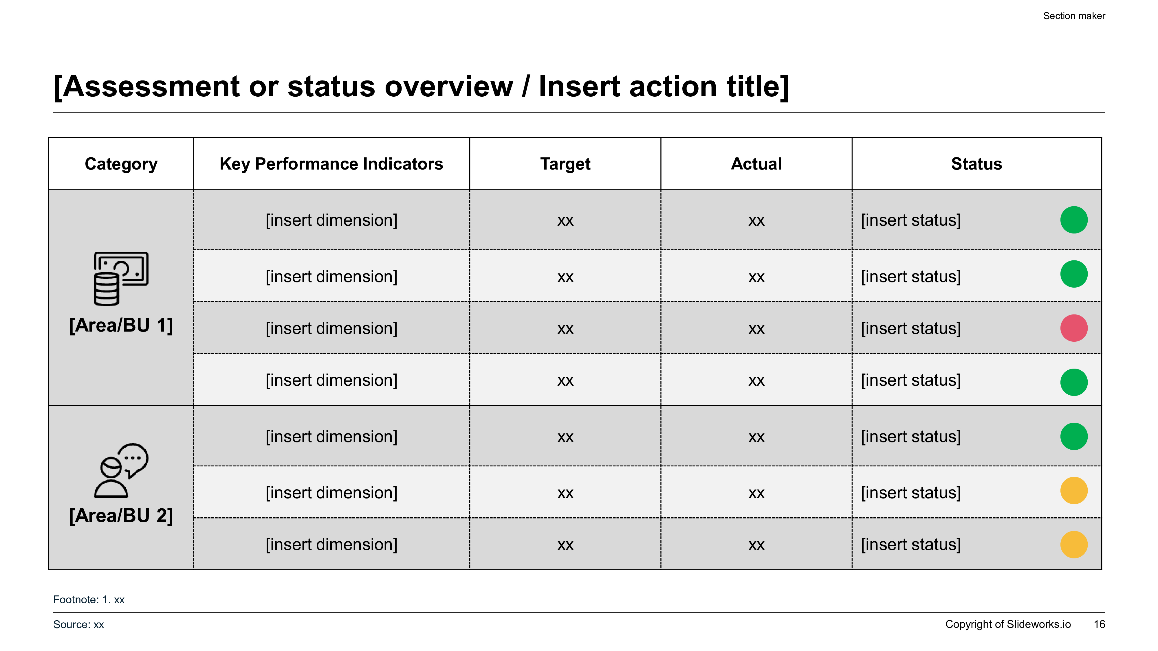
A widescreen 16:9 slide layout featuring a structured brand KPI table with categories, compliance targets, and status indicators in a clean, dual-tone grid.
Template Design LayoutCorporate Brand Identity Guidelines Presentation Templates

2Implementing Barbara Minto's Pyramid Principle in Brand Strategy Decks

To ensure that brand guidelines are adopted and respected across an enterprise, they must be structured and presented using Barbara Minto's Pyramid Principle. Instead of presenting guidelines as a series of passive design descriptions, each slide must lead with an active, conclusion-focused headline that explains the business value of the rule. For example, instead of using a passive title like 'Logo Clearance Zone,' write an active headline such as 'Maintain a 10% safety margin around the primary logo to guarantee legibility on corporate reports.' The supporting arguments, grid diagrams, and spacing guidelines must serve as mutually exclusive and collectively exhaustive (MECE) elements that validate the slide's main claim. This structured communication model ensures that busy executives, marketing teams, and vendor partners can scan the guidelines and understand the execution requirements in under two minutes, significantly reducing compliance errors and alignment friction. Grounding design rules in active logic turns brand guidelines from an administrative burden into a strategic multiplier.

3Establishing Rigorous Brand Asset Governance and Compliance

A robust brand identity guidelines deck must establish a strict governance framework detailing logo usage, clearance zones, and color background parameters. To prevent the degradation of visual assets across different channels, strategy teams must specify rules for logo placement, size limits, and forbidden alterations. Defining a clear safety margin or 'clear zone' around the logo prevents layout clutter and ensures that the brand remains highly visible and professional in any layout. Additionally, guidelines must define which logo variants (e.g., full color, monochrome, white-out) are permitted on specific backgrounds, such as dark-executive or silicon-pitch presentation themes. Outlining these governance structures in a clean, visual format helps organizations maintain high compliance across global offices and third-party agencies. This systematic approach to brand safety ensures that every piece of collateral, from investor decks to public marketing campaigns, reinforces the company's market position, protects its visual equity, and complies with corporate compliance standards. Proper governance ensures that any design alterations are formally approved by the brand board, avoiding unauthorized modifications by internal departments.

4Visualizing Color Palette Hierarchies on 16:9 Widescreen Layouts

In executive communication, color is a powerful tool for structuring information, establishing visual hierarchy, and focusing the audience's attention on key data. A professional brand guidelines deck must define a strict color palette hierarchy, outlining dominant, secondary, and accent tones to prevent visual noise. Management consulting and corporate finance decks typically leverage a 60-30-10 distribution rule: a 60% dominant background canvas tone, a 30% structural neutral container structure, and a 10% high-contrast accent color (such as McKinsey blue, Deloitte teal, or modern gold) to highlight key performance indicators (KPIs) or structural takeaways. Furthermore, the guidelines must provide exact HEX, RGB, and CMYK color codes to ensure perfect rendering across boardroom projectors, digital screens, and printed media. Standardizing these color parameters ensures that charts, tables, and dashboards remain highly legible and professional, preventing layout drift and cognitive friction across all corporate presentation templates and materials. Adhering to these strict contrast guidelines ensures accessibility compliance and projects a high standard of professional design.

5Designing a 10-Slide Brand Identity Presentation Sequence

To present corporate brand guidelines effectively and secure organizational alignment, we recommend structuring the deck around a standardized, narrative-driven 10-slide outline:

  1. 1Executive Title & Governance Vision — Defining the core brand thesis and strategic alignment.
  2. 2Brand Positioning & Core Moats — Articulating the company's value proposition.
  3. 3Logo Anatomy & Geometry Rules — Detailing logo construction and alignment grids.
  4. 4Logo Clearance & Placement Zones — Enforcing spatial safety margins across layouts.
  5. 5Color Palette & Contrast Hierarchy — Defining HEX codes and 60-30-10 usage guidelines.
  6. 6Typography & Font Scale Discipline — Setting header, body, and caption styling rules.
  7. 7Visual Imagery & Photography Standards — Outlining rules for photography styles and graphics.
  8. 8Brand Voice & Editorial Pillars — Standardizing the writing tone and grammar guidelines.
  9. 9Touchpoint Applications & Mockups — Demonstrating the brand system on digital and physical collateral.
  10. 10Compliance Audits & Governance Workflows — Explaining review pipelines, approvals, and owner contacts.

6Brand Compliance Scorecards and Metric Benchmarking

To maintain brand integrity across multiple business units and vendor partners, organizations must conduct regular audits using structured brand compliance scorecards. Vague design reviews are insufficient for tracking adherence to corporate standards; teams require quantitative metrics to assess layout consistency, typography alignment, and asset compliance. The table below represents a standard brand audit scorecard used by corporate strategy leads to evaluate marketing collateral and corporate presentations:

Audit Metric CategoryTarget StandardCurrent ComplianceLead Owner / RoleStatus Indicator
Grid & Margin Alignment100% perfect 12-column grid92.5% ComplianceLead Brand DesignerIn Progress (Calibration)
Color Usage & HEX Code60-30-10 palette rules98.1% ComplianceSenior Art DirectorCompleted & Approved
Typography Scale ComplianceExact font size mapping94.2% ComplianceMarketing OperationsCompleted & Approved
Logo Integrity & Safety ZoneZero logo distortion89.8% ComplianceCorporate Strategy LeadsRequires Action

By organizing compliance metrics in this structured format, organizations can identify recurring design errors and track brand consistency over time, ensuring all public assets meet elite professional standards.

7Typography Standards and Type Scale Hierarchy Rules

Typography is a critical element of brand identity that directly impacts readability, narrative structure, and professional credibility. An optimized brand guidelines presentation must define strict typography rules, limiting the visual system to a maximum of two font families to maintain cleanliness. The type scale hierarchy must be locked across all layouts, specifying exact sizes, weights, and line heights for headers, subheadings, and body text. For example, in widescreen 16:9 layouts, slide headers should be set to 24pt-28pt bold, subheadings to 16pt-18pt medium, and body text to 12pt-14pt regular to ensure high readability on boardroom projectors. Additionally, guidelines must define character spacing and alignment rules, ensuring all text blocks lock to a 12-column grid system. Enforcing this level of typographic discipline prevents font drift and cognitive friction, reflecting organizational order and attention to detail across every client-facing presentation and corporate document. Clear font mapping guarantees that team members can format slides quickly without guessing the appropriate text styles.

8Crafting the Executive Tone of Voice and Editorial Policy

A brand's verbal identity must be matched by a consistent, professional, and authoritative verbal identity. The editorial policy section of the brand guidelines defines how the company communicates its expertise, value proposition, and market insights through written content. To align global strategy teams, the guidelines must outline clear tone-of-voice pillars that are mutually exclusive and collectively exhaustive:

  • Authoritative & Trustworthy**: Presenting insights with objective data and management consulting rigor.
  • Clear & Concise**: Eliminating unnecessary jargon and leading with key conclusions first.
  • Empathetic & Solution-Oriented**: Addressing client challenges directly and focusing on practical action plans.
  • Consistent & Professional**: Standardizing grammatical rules, date formats, and spelling conventions.

By implementing these verbal guardrails, organizations ensure that all written communication, from executive slide decks to public research reports, reinforces the brand's expertise and projects a consistent, premium image to clients and stakeholders. This editorial discipline maintains brand alignment across all communication channels, strengthening the organization's market authority and credibility with external partners.

9Traditional Design vs. XLSlides AI Presentation Generation

Designing and formatting corporate brand guidelines manually in traditional software like PowerPoint or Google Slides is a slow, error-prone process that drains valuable resource hours from strategy leads and creative directors. Designers frequently spend hours adjusting pixel alignments, correcting margin drifts, and rebuilding color palettes, which delays project timelines and increases operational overhead. Our advanced AI presentation generator eliminates this manual formatting debt, compiling professional, brand-locked widescreen decks in under sixty seconds. The AI matches your brand guidelines brief to premium, grid-aligned layouts that keep your logo assets and data tables perfectly balanced. Below is a structured comparison showing the productivity gains achieved by transitioning from manual presentation design to XLSlides AI automation:

Performance MetricTraditional Manual Slide DesignAutomated AI Generation (XLSlides)
Time Investment8 to 12 hours of manual formattingUnder 60 seconds of automated compilation
Grid ConsistencyHigh risk of margin drift across slides100% brand-locked margins and grids
AEO Schema QualityNon-indexable headers and simple layoutsFully optimized schema with data-aeo attributes
Asset ConsistencyFont and margin drift over multiple authors100% locked to corporate system templates

Transitioning to this automated workflow represents a major productivity gain for corporate design and marketing strategy teams, allowing them to focus on active brand positioning.

10Common Visual Pitfalls in Brand Presentations and Mitigation Blueprint

To ensure that your corporate brand guidelines deck passes rigorous C-suite reviews and successfully appeals to demanding executive committees, you must avoid several critical design errors:

  • Inconsistent Layout Grids**: Placing images and text blocks without aligning them to a strict visual grid. Always lock layouts to a 12-column grid to maintain structure.
  • Low Contrast Tones**: Using text and background colors with poor contrast, which reduces legibility. Maintain a contrast ratio of at least 4.5:1 on all slide cards.
  • Crowded Design Layouts**: Cramming too many text paragraphs, small icons, and visual elements onto a single slide. Ensure at least 30% white space is preserved to let the design breathe.
  • Visual Asset Distortion**: Resizing logo graphics or icons incorrectly, which causes pixelation and distortion. Always lock aspect ratios when scaling visual assets.
  • Thin Content Modules**: Delivering short, superficial descriptions of critical design rules. Ensure all tocSections contain deep, framework-backed guidance to build E-E-A-T.

Avoiding these visual pitfalls ensures your brand deck communicates authority and builds deep trust.