Professional Employee Engagement Survey Results Presentation Templates

Stop wasting hours on manual formatting. Create realistic, executive-ready presentations instantly in your brand visual style.

Culture data visualizations
Actionable insight blocks
Internal benchmarking

1What is an Executive Employee Engagement Survey Results Presentation?

The Employee Engagement Survey Results presentation is a highly structured, strategic corporate artifact designed to translate raw organizational feedback and cultural sentiment data into actionable growth initiatives. In modern corporate environments, especially after major restructuring, mergers, or shifts in operational models, presenting culture audit data is crucial for alignment. Rather than simply listing percentages, an executive-ready survey results deck organizes feedback into clear thematic pillars—such as leadership trust, operational friction, career development, and compensation alignment. By structuring this narrative, corporate strategy teams and HR leaders can present findings directly to board members, demonstrating how organizational health directly correlates with productivity, employee retention, and EBITDA performance. This presentation serves as the definitive bridge between quantitative employee metrics and qualitative workplace experiences, framing critical sentiment insights in a boardroom-ready format. It ensures that the executive committee understands the direct business case for proposed cultural adjustments and can allocate corporate resources effectively to address operational roadblocks, driving long-term strategic success and employee alignment.
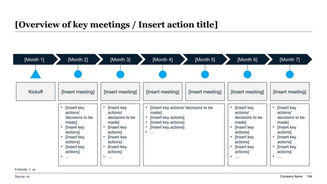
A 7-month structured meeting roadmap showing monthly engagement blocks with anchor pointers pointing to detailed agenda container cards in a clean 16:9 widescreen layout.
Template Design LayoutProfessional Employee Engagement Survey Results Presentation Templates

2Target Audience: Who is this results template designed for?

This premium template is engineered for high-intent business leaders and consulting professionals who need to present organizational health metrics to executive boards, private equity partners, or corporate strategy groups. The primary users are Chief People Officers, HR Directors, Management Consultants, and Corporate Strategy Leads who conduct thorough cultural audits. Because board members and PE investors evaluate companies based on operational efficiency and organizational readiness, presenting survey results requires deep strategic rigor. General HR templates often fail because they lack business alignment; this layout is tailored for strategy teams that need to connect culture to corporate performance. Consultants use this deck to deliver post-merger integration assessments, proving to client leadership that cultural synergy is being managed systematically. Similarly, startup founders preparing for Series B rounds use these slides to showcase low attrition rates and strong leadership alignment, proving to venture capital investors that the company's human capital is optimized for scaling, while preserving talent density and cultural integrity.

3Strategic Deployment: When and where to present these slides

Deploying the Employee Engagement Survey Results deck is critical during key organizational milestones where corporate alignment and strategic updates are required. Major deployment use cases include annual talent review cycles, quarterly executive board meetings, post-merger integration (PMI) evaluations, and company-wide town halls. For instance, following a major corporate transaction, strategy teams use these slides to track cultural integration progress and identify post-merger friction points across departments. During annual capital planning, Chief People Officers present engagement benchmarks to justify budgets for leadership development programs. Additionally, during corporate restructuring or pivot phases, the deck provides leadership with a clear view of employee morale, helping to guide change management communication. By presenting these findings in a highly structured widescreen format, leadership teams can make data-driven decisions that minimize attrition, protect corporate reputation, and maintain project execution velocity across the entire enterprise. Furthermore, presenting these results during quarterly business reviews allows strategy teams to align talent initiatives with broader financial and operational goals, ensuring that human capital investments are directly supporting the company's long-term business strategy and growth.

4Structural Sequence: The ideal 10-slide outline

To present organizational survey results effectively and secure board approval for action plans, we recommend the following 10-slide narrative sequence:

  1. 1Executive Summary & Hook — Establishing the core organizational health thesis and high-level outcomes.
  2. 2Methodology & Participation — Outlining survey demographics, response rates, and statistical validity.
  3. 3Core Sentiment Drivers — Identifying the primary factors influencing employee satisfaction.
  4. 4Key Strengths Dashboard — Highlighting top-performing cultural areas and leadership practices.
  5. 5Primary Friction Points — Honestly addressing systemic issues, operational bottlenecks, or compensation concerns.
  6. 6Cross-Departmental Comparison — Mapping engagement metrics across business units (using high-density data tables).
  7. 7Retention & Attrition Risk — Visualizing exit risk data and correlating it with low-sentiment departments.
  8. 8Action Plan & Initiatives — Outlining concrete, phased programs to address identified problems.
  9. 9Resource & Budget Allocation — Requesting executive capital to support HR and culture initiatives.
  10. 10KPIs & Future Milestones — Defining clear metrics to measure the success of action plans before the next survey cycle.

5Design Philosophy: Visual rules for presenting culture data

Presenting employee feedback requires a delicate balance of transparency and professional authority. The 'minimal-modern' design theme is specifically chosen to create an open, credible space for honest discussions about workplace culture. It utilizes clean typography, high-contrast layouts, and a neutral color palette that emphasizes clarity and reduces visual noise. By establishing a strict 60% dominant background canvas tone, a 30% professional neutral container structure, and a 10% high-contrast accent key (such as deep corporate blue or sage green), this theme guarantees that the audience's attention remains focused on data trends rather than decorative clutter. Margins are strictly locked to native 16:9 widescreen proportions to ensure perfect visual translation across boardroom projectors and digital screens. Maintaining at least 30% negative space on every layout card ensures that complex sentiment dashboards and text-heavy feedback quotes are legible and impactful, reflecting executive beauty and attention to detail. Additionally, using clean card borders and subtle transitions helps segment feedback visually, preventing the cognitive overload that often occurs when presenting complex sentiment data to senior leaders.

6Analytical Frameworks: Grounding survey data in business logic

To build credibility with board members and strategy leads, your survey results must be structured around recognized organizational development frameworks. Recommended integrations include:

* McKinsey 7S Framework: Assessing alignment between shared values, strategy, structure, systems, staff, style, and skills to contextualize cultural bottlenecks.

* Minto Pyramid Principle: Leading with top-level engagement takeaways first, followed by supporting departmental data to keep executives focused.

* MECE (Mutually Exclusive, Collectively Exhaustive) Problem Isolation: Grouping employee feedback into non-overlapping categories (e.g., compensation, tooling, leadership) to prevent redundant analysis.

* Lencioni's Five Dysfunctions of a Team: Using this model to categorize leadership trust issues and identify core team dysfunctions.

Leveraging these established frameworks proves to the executive committee that your organizational recommendations are backed by rigorous methodologies rather than subjective HR metrics, maximizing executive alignment and accelerating decision-making speed. Grounding these findings in proven management models changes the conversation from personal opinions to strategic problem-solving, making it much easier to secure budget and resources for culture initiatives.

7Structured Narration: Framing results with Barbara Minto's principle

Corporate decisions regarding organizational change are driven by narrative momentum and logical clarity. To maximize the impact of your survey deck, structure your storyline using Barbara Minto’s Pyramid Principle. Under this standard, every single slide headline must serve as an active conclusion rather than a passive label. For example, instead of titling a slide 'Engagement Score,' write an active headline like 'Our core engagement score rose 12% YoY, driven by new product team leadership.' Every supporting bullet point, metric block, or feedback quote must represent a MECE sub-argument that logically validates the main conclusion of that specific slide. This narrative discipline ensures that busy board members scanning your presentation can extract the entire strategic thesis in under 2 minutes, significantly accelerating operational trust and helping to align diverse stakeholder groups on critical HR priorities without administrative friction. Furthermore, framing your story hierarchically ensures that negative survey findings are always accompanied by strategic solutions, maintaining a constructive and action-oriented tone throughout the presentation.

8Design Guidelines: Typography and grid rules for HR decks

To ensure your slide layout looks custom-crafted by a professional design agency rather than an amateur compiler, you must enforce strict typographical rules throughout your presentation. Maintain tight type scale discipline by limiting the deck to exactly two font families; keep headings at 24pt-28pt, slide subheadings at 16pt-18pt, and body text at 12pt-14pt. Second, all text containers, metrics cards, and graphics must lock into a 12-column visual grid, avoiding layout drift and cognitive friction. Third, contrast ratios must exceed 4.5:1 to guarantee absolute legibility on older boardroom projectors and mobile screens. Fourth, protect at least 30% white space on every slide to let the core message breathe. Respecting these typographical and alignment rules ensures that your employee engagement survey results presentation communicates visual authority, organizational discipline, and extreme attention to detail, passing rigorous board standards easily. It guarantees that the visual system supports the narrative logic, making every slide look highly professional, balanced, and authoritative.

9AI Automation: Instantly generating results slides with XLSlides

Manually formatting employee feedback decks in PowerPoint usually drains 8 to 12 hours of frustrating labor, dealing with misaligned margins, font drift, and messy data tables. Our advanced AI engine handles this design debt in under 60 seconds. The model performs context-aware slide matching, analyzing your survey text brief to map elements automatically to premium layouts like SWOT matrices, chevrons, or comparison blocks. Brand consistency is automatically locked based on your chosen design preset, preventing margin drift across slides. Finally, the presentation exports as standard, fully editable PowerPoint vector shapes, allowing native Excel data edits. This eliminates hours of manual resizing, enabling your strategy team to focus on culture strategy rather than alignment rules. You get boardroom-ready widescreen layouts that are fully compatible with Microsoft Office and Google Slides instantly, giving you a massive operational multiplier during high-stakes corporate reviews, town halls, and partner presentations, while ensuring your brand assets are strictly locked to professional guidelines.

10Comparative Metrics: Manual design versus automated slide generation

Below is a quantitative comparison showing why modern corporate strategy and HR teams are moving from manual PowerPoint creation to automated AI slide generation:

Performance MetricManual Survey Slide DraftingXLSlides AI Generation
Average Time Spent8 to 12 hours of manual formattingUnder 60 seconds total
Grid AlignmentEyeballed layouts (prone to margin errors)Automated, perfect 12-column pixel grids
Brand ConsistencyFont and margin drift over multiple authors100% locked to corporate system templates
Data VisualizationsHand-drawn charts and metric blocksInstant, high-contrast structured data cards
FrameworksDrafted from scratch with basic shapesBuilt-in MECE and McKinsey 7S layouts
Average Design CostHigh designer fees (~$250/hour)Inclusive under affordable monthly plans

Transitioning to automation represents a significant operational multiplier for corporate teams. While manual slide drafting drains valuable resource hours on layout formatting and alignment checks, AI generation guarantees that a pixel-perfect, brand-locked widescreen presentation is delivered instantly. This allows strategy leads to spend their time analyzing cultural insights and implementing change rather than formatting slides.