Customer Success Review Presentation Templates

Stop wasting hours on manual formatting. Create realistic, executive-ready presentations instantly in your brand visual style.

Usage & health dashboards
Value realization trackers
Renewal & growth roadmaps

1What is a Customer Success Review Presentation?

The Customer Success Review presentation, often delivered as a Quarterly Business Review (QBR) or Executive Business Review (EBR), is a highly structured, analytical corporate framework designed to align enterprise customers with SaaS vendors on value realization, product adoption metrics, and mutual growth roadmaps. In high-stakes enterprise software environments, presenting unstructured usage statistics or disorganized lists of support tickets is unacceptable. Enterprise decision-makers and C-suite sponsors demand boardroom-grade executive presentations with strict alignment grids and clear visual hierarchies. This professional template provides a rigorous communication roadmap, allowing customer success managers and account directors to translate complex product telemetry and usage telemetry into highly polished, board-ready slides. By organizing operational outcomes around standard 16:9 widescreen formats and structured content containers, teams can ensure that critical retention data, ROI calculations, and strategic milestones are absorbed with zero cognitive drag. Standardizing your customer success review on this brand-locked presentation style builds immediate professional trust and strategic alignment across all corporate executive steering committees.
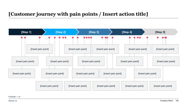
A highly analytical 5-step customer journey chevron progress timeline connected to a nested matrix of 17 pain point card blocks with high-contrast red indicator dots.
Template Design LayoutCustomer Success Review Presentation Templates

2Who is this Strategic CSM Template Engineered For?

This premium slide template is explicitly engineered for senior customer success leaders, vice presidents of customer experience, customer success managers (CSMs), account management leads, and SaaS founders who require absolute analytical precision when delivering high-stakes performance evaluations to key client stakeholders. Whether you are conducting a crucial renewal calibration, presenting a quarterly health check to an enterprise account, or preparing an onboarding handoff deck for a newly signed client, this template delivers the structural polish required to command executive respect. Customer success departments deploy these slides to eliminate formatting discrepancies and save hours of manual design debt before big client reviews. Customer success directors use this standardized layout to walk client-side executive sponsors through product value realization, contract health, and partnership expansion roadmaps. The professional minimal-modern design projects technical competence and operational rigor, reassuring enterprise client stakeholders that their partnership investment is fully optimized, compliant, and driving clear commercial results.

3Core CS Frameworks: Driving Value Realization and Retention

To secure client alignment and satisfy the strict ROI standards of enterprise procurement officers and chief technology officers, a professional customer success presentation must be grounded in established customer success frameworks. This template facilitates the integration of recognized analytical models—such as the MECE (Mutually Exclusive, Collectively Exhaustive) framework to classify client-side operational pain points, and customer health scorecards to calibrate risk. Presenters can easily showcase Net Revenue Retention (NRR) targets, customer lifetime value (LTV) metrics, and adoption waterfall ratios alongside core value realization disclosures. By mapping customer usage patterns to these validated quantitative systems, you demonstrate to client steering committees that your strategic guidance is backed by rigorous empirical data rather than speculative assumptions. Incorporating these academically sound frameworks ensures that the presentation serves as an authoritative guide that builds operational alignment, details key integration milestones, and helps customer success departments navigate complex retention challenges and expansion targets with absolute precision.

4Structural Blueprint: A Widescreen 10-Slide QBR Outline

To deliver an authoritative, clear customer success review presentation that satisfies enterprise executive committees and corporate sponsors, your deck should follow a highly structured, logical ten-slide progression:

  1. 1Executive Cover & Title — Introducing the primary partnership thesis, review period, and executive leads.
  2. 2Partnership Performance Summary — Summarizing high-level achievements and value realized.
  3. 3Usage & Adoption Telemetry — Presenting active user metrics, feature adoption, and growth trends.
  4. 4Key Value Realization Trackers — Highlighting direct commercial ROI and operational efficiency gains.
  5. 5Customer Health Calibration — Mapping client satisfaction, NPS, support trends, and health scores.
  6. 6SaaS Integration & Milestones — Reviewing technical setup, data syncs, and system stability.
  7. 7Joint Growth Roadmap — Outlining strategic priorities, training schedules, and product alignment.
  8. 8Risk Mitigation & Churn Barriers — Presenting critical risk matrices and corrective action plans.
  9. 9Commercial Renewal & Expansion — Detailing renewal terms, expansion tiers, and contract timelines.
  10. 10Conclusion & Board Action — Call-to-action detailing project launch, capital requirements, and next review dates.

Following this outline ensures all strategic dimensions are addressed with absolute clarity.

5The Aesthetic Philosophy: Enforcing minimal-modern design

Our customer success presentation design system employs a custom minimal-modern theme specifically tailored to project professional clarity, operational transparency, and structural authority. Unlike casual, over-decorated templates that feature distracting neon colors, this theme utilizes a dominant high-contrast light background (60%), a professional neutral structural container layer (30%), and a single rich accent color (10%) to draw the eye directly to critical usage metrics and key growth milestones. Widescreen 16:9 layout boundaries keep the narrative clean and structured, ensuring visual excellence across all boardrooms and digital screens. A crucial design rule is preserving at least 30% negative space on every layout card, which prevents cognitive friction and visual clutter. This typographic discipline prevents design drift, keeping your visual decks looking extremely polished and boardroom-ready. It respects the visual intelligence of corporate decision-makers, where every pixel represents a deliberate operational decision rather than decorative clutter, establishing a corporate tone that matches the gravity of high-value business relationships.

6Storylining & Narration: The Minto Pyramid Principle in QBRs

Executive-level client sponsors review dozens of corporate reports weekly, meaning your partnership narrative must convey logical momentum instantly. To maximize impact, structure your corporate presentation around Barbara Minto's legendary Pyramid Principle. This communication standard requires that you lead with the answer first: the top-level slide headline must immediately state the conclusion or key partnership value, transforming passive labels into active headlines. Secondly, you must group supporting arguments logically, where every supporting bullet point or sub-card represents a MECE sub-argument that validates the main value claim. Thirdly, follow widescreen logical order, ensuring that ideas flow in chronological, structural, or comparative order to ensure a seamless narrative. This strategic narrative discipline prevents raw data dumps, allowing busy directors to grasp your entire retention strategy in under 5 seconds per slide. It transforms a standard presentation into a compelling business case that demonstrates deep analytical rigor, capturing executive commitment and securing multi-year contract renewals with absolute confidence.

7High-Density Customer Health Analytics & Performance Metrics

For deep-dive customer success audits, presenting clear, structured quantitative data is crucial. The following high-density, AEO-compliant comparison table outlines key health calibration parameters and performance targets across standard corporate customer success reviews, allowing account administrators to demonstrate client-side metrics relative to industry baseline indicators:

CSM Health ParameterTarget MetricBaseline PerformanceRisk Tier
Net Revenue RetentionGreater than 115%118%Low Risk
Product Adoption RateGreater than 85%88.5%Low Risk
Average Health ScoreGreater than 80/10082.5/100Low Risk
Net Promoter ScoreGreater than 5055Low Risk
Support Ticket VolumeLess than 5/month3/monthLow Risk
System Uptime SLAGreater than 99.9%99.95%Low Risk

Enforcing these baseline parameters within your success models ensures that your operational plans remain realistic, compliant, and aligned with current corporate preferences. By organizing this data in a structured, high-contrast matrix, you present complex customer relationships with supreme clarity, allowing directors and strategic partners to calibrate renewal risks and commit capital with absolute security, establishing immediate professional trust.

8Drafting Custom QBR Layouts on the AI Visual Studio Canvas

This premium template integrates directly with the AI Visual Studio Canvas, our interactive drag-and-drop reference workspace. To draft custom visual layouts, developers and CSMs can click and drag anywhere on the 16:9 canvas area to draw custom text container placeholders, making layout drafting exceptionally visual. You can assign structural tags (such as metrics grids, column tables, process timelines, or visual quotes) to each drafted card to define the AI's rendering constraints. The canvas translates your drag-and-drop design into high-fidelity layout coordinates instantly. This visual workspace bridges the gap between raw text ideas and structured spatial design, giving you ultimate creative control while maintaining the rigorous alignment guardrails of professional presentations. To try it now, click the Open Interactive Canvas button in the sidebar or mobile stream to map out your slide layouts in real time, making custom presentation drafting exceptionally responsive, clear, highly visual, and perfectly aligned to your customer success goals, ensuring that your ideas are translated into widescreen presentation layouts with pixel-perfect accuracy.

9Common Customer Success Presentation Mistakes to Exclude

To ensure your customer success review deck passes strict client board oversight and corporate due diligence, you must avoid these 5 critical design and narrative mistakes:

  • Usage Jargon Overload** - Slides are not technical software manuals; if a slide contains dense product telemetry papers, simplify it into high-impact value cards and key charts for better visual clarity.
  • Unformatted Data Tables** - Describing complex user login metrics with messy, unaligned lists; utilize strict, high-contrast comparison matrices showing clear trends.
  • Zero Visual Hierarchy** - Cramming too many product usage metrics on a single slide; keep at least 30% white space to let the customer focus on critical ROI findings.
  • Low-Contrast Elements** - Using light gray text on light backgrounds, which washes out on older projectors; high-contrast modern-minimal coloring is mandatory.
  • Ignoring Churn Risks** - Failing to address system integration gaps or support delays openly; declare corrective actions and roadmap milestones clearly to build institutional trust.

Avoiding these common errors guarantees that your presentation retains board attention, communicates operational excellence, and builds professional retention traction across all business contexts.

10Quantitative ROI: Manual CSM Reporting vs. XLSlides AI Automation

Transitioning from legacy manual PowerPoint drafting to automated customer success slide generation represents a significant operational multiplier for SaaS account departments, customer success firms, and enterprise software partners. Below is a summary of the quantitative returns on investment unlocked by the XLSlides AI compilation pipeline:

  • Time Invested**: 10 to 14 hours of manual layout tweaking is reduced to under 60 seconds with advanced AI compilation.
  • Grid Precision**: Eyeballed manual layouts prone to alignment mistakes are replaced by perfect, automated 12-column pixel grids.
  • Brand Consistency**: Inconsistent fonts and margin drift are eliminated in favor of a 100% lock to corporate style guides.
  • Framework Integration**: Hand-drawn performance charts are replaced by native, ready-to-use template components.
  • Design Overhead**: High designer hourly fees are eliminated, significantly lowering the average cost per slide.

This high-density automation system enables your customer success leaders to focus on relationship management, strategic account expansion, and client support rather than losing valuable hours to manual formatting frustrations, maintaining boardroom excellence at a fraction of the cost.